-->

Daftar Kode Warna HTML Pada Blog

Kode warna HTML adalah sebuah kode warna yang digunakan untuk membuat sebuah warna pada pembuatan script HTML. Sebenarnya untuk mendapatkan kode warna HTML sendiri sebenarnya kita dapat juga menggunakan Photoshop, akan tetapi mungkin sobat akan sedikit lelah karena harus bolak balik membuka program yang Cukup berat tsb. Tapi sobat tidak perlu khawatir karena disini saya akan mempermudah kerja sobat untuk Mendapatkan Kode Warna HTML, berikut ini adalah warna-warna yang bisa Anda pilih


Pink - FFC0CB
LightPink - FFB6C1
HotPink - FF69B4
DeepPink - FF1493
PaleVioletRed - DB7093
MediumVioletRed - C71585
Red colors Light Salmon - FFA07A
Salmon - FA8072
Dark Salmon - E9967A
Light Coral - F08080
Indian Red - CD5C5C
Crimson - DC143C
Fire Brick - B22222
Dark Red - 8B0000
Red - FF0000
range color Orange Red - FF4500
Tomato - FF6347
Coral - FF7F50
Dark Orange - FF8C00
range - FFA500
Gold - FFD700
colors Yellow - FFFF00
Light Yellow - FFFFE0
Lemon Chiffon - FFFACD
Light Goldenrod Yellow - FAFAD2
Papaya Whip - FFEFD5
Moccasin - FFE4B5
Peach Puff - FFDAB9
Pale Goldenrod - EEE8AA
Khaki - F0E68C
DarkKhaki - BDB76B
Brown colors Cornsilk - FFF8DC
Blanched Almond - FFEBCD
Bisque - FFE4C4
Navajo White - FFDEAD
Wheat - F5DEB3
Burly Wood - DEB887
Tan - D2B48C
Rosy Brown - BC8F8F
Sandy Brown - F4A460
Goldenrod - DAA520
Dark Goldenrod - B8860B
Peru - CD853F
Chocolate - D2691E
Saddle Brown - 8B4513
Sienna - A0522D
Brown - A52A2A
Maroon - 800000
Dark Olive Green - 556B2F
Olive - 808000
OliveDrab - 6B8E23
Yellow Green - 9ACD32
Lime Green - 32CD32
Lime - 00FF00
LawnGreen - 7CFC00
Chartreuse - 7FFF00
Green Yellow - ADFF2F
Spring Green - 00FF7F
Medium Spring Green - 00FA9A
Light Green - 90EE90
Pale Green - 98FB98
Dark Sea Green - 8FBC8F
Medium Sea Green - 3CB371
SeaGreen - 2E8B57
Forest Green - 228B22
Green - 008000
Dark Green - 006400
Cyan colors Medium Aquamarine - 66CDAA
Aqua - 00FFFF
Cyan - 00FFFF
Light Cyan - E0FFFF
Pale Turquoise - AFEEEE
Aquamarine - 7FFFD4
Turquoise - 40E0D0
Medium Turquoise - 48D1CC
Dark Turquoise - 00CED1
Light Sea Green - 20B2AA
Cadet Blue - 5F9EA0
Dark Cyan - 008B8B
Teal - 008080
Blue colors Light Steel Blue - B0C4DE td>
Powder Blue - B0E0E6
LightBlue - ADD8E6
SkyBlue - 87CEEB
Light Sky Blue - 87CEFA
Deep Sky Blue - 00BFFF
Dodger Blue - 1E90FF
Cornflower Blue - 6495ED
Steel Blue - 4682B4
Royal Blue - 4169E1
Blue - 0000FF
Medium Blue - 0000CD
Dark Blue - 00008B
Navy - 000080
Midnight Blue - 191970
Purple colors Lavender - E6E6FA
Thistle - D8BFD8
Plum - DDA0DD
Violet - EE82EE
Orchid - DA70D6
Fuchsia - FF00FF
Magenta - FF00FF
Medium Orchid - BA55D3
Medium Purple - 9370DB
Blue Violet - 8A2BE2
Dark Violet - 9400D3
Dark Orchid - 9932CC
Dark Magenta - 8B008B
Purple - 800080
Indigo - 4B0082
Dark Slate Blue - 483D8B
Slate Blue - 6A5ACD
Medium Slate Blue - 7B68EE
White - FFFFFF
Snow - FFFAFA
Honey dew - F0FFF0
Mint Cream - F5FFFA
Azure - F0FFFF
AliceBlue - F0F8FF
Ghost White - F8F8FF
White Smoke - F5F5F5
Seashell - FFF5EE
Beige - F5F5DC
Old Lace - FDF5E6
Floral White - FFFAF0
Ivory - FFFFF0
Antique White - FAEBD7
Linen - FAF0E6
Lavender Blush - FFF0F5
Misty Rose - FFE4E1
LightGray - D3D3D3
Silver - C0C0C0
DarkGray - A9A9A9
Gray - 808080
DimGray - 696969
Light Slate Gray - 778899
SlateGray - 708090
Dark Slate Gray - 2F4F4F
Black - 000000


Semoga bermanfaat dan saya ijin pamit biggrin

Add Expanding Photo Stack Effect for Blogger

Today im gonna explain simple tutorial about How to add Add Expanding Photo Stack Effect for Blogger Images. Every modern browsers support with this effect. You can add this to blogger side bar by re-size images.Im just using CSS3 for this animation effect.Hope you can understand it.if you have any problem regarding to this tutorial let me know. Use below button for demo.


Expanding+Photo+Stack
          

How to Add Add Expanding Photo Stack Effect for Blogger


1. Go to Blogger Dashboard > Layout
2. Click Add Gadget and select 'HTML/Javascript'
3. Paste below code.
/* The CSS Code for the image starts here bloggertrix.com
<style>
#btrix_imgstack{
  width:300px;margin:0 auto;margin-top:2%;
}

#btrix_imgstack a{
  width:288px;
  height:200px;
  position:absolute;
  display:block;
  border:6px solid #f0f0f0;
  border-radius:2px;
  box-shadow:0 0 10px rgba(0,0,0,.3);
  transition:margin .5s;
  -webkit-transition:margin .5s;
}

#btrix_imgstack img{
  width:288px;
  max-height:100%;
}

#btrix_imgstack a:first-of-type{
  margin-top:-5px;
  margin-left:-20px;
  transform:rotate(-3deg);
  -webkit-transform:rotate(-3deg);
}

#btrix_imgstack a:nth-of-type(2){
  margin-top:-5px;
  margin-left:-10px;
  z-index:-1;}

#btrix_imgstack a:last-of-type{
  transform:rotate(3deg);
  -webkit-transform:rotate(3deg);
  z-index:-2;}

#btrix_imgstack:hover a:first-of-type{
  margin-left:-310px;
  margin-top:5px;}

#btrix_imgstack:hover a:nth-of-type(2){
  margin-top:-5px;}

#btrix_imgstack:hover a:last-of-type{
  margin-left:290px;
  margin-top:5px;}

#btrix_imgstack a:first-of-type:hover,#btrix_imgstack a:last-of-type:hover{margin-top:-5px;}
#btrix_imgstack a:nth-of-type(2):hover{margin-top:-10px;}
</style>
<div id="btrix_imgstack">
 
  <a href="#">
    <img src="https://blogger.googleusercontent.com/img/b/R29vZ2xl/AVvXsEhquL-jMYq__Kfr9IxQY9aMDVj-J3CGp4WWZXT2kaxmN5dT0twp3fQfG7BHZULDav0H0tTlBRtIXnz1gFFEWn4uJDX2htz4Wjjz1u3B5uD2QxI6B_jHK7-T4wk9X8gGuKS-eCpBlID4IY4/s1600/btrix_image1.jpg" alt />
  </a>
 
  <a href="#">
    <img src="https://blogger.googleusercontent.com/img/b/R29vZ2xl/AVvXsEj9ibqlDt2XtsofRj4VC-U7xHKshXXCKgvJVLZp2NvSDqWH6lBdfFwO1W4wZElmdVUbGgALsX-cmBj7px5pgzq-TjdVDntjVDSMhKYkpFGCd03U93P4pld8ddEVf_D_2N0ZgleCoU8yFg8/s1600/btrix_image2.jpg" alt />
  </a>
 
  <a href="#">
    <img src="https://blogger.googleusercontent.com/img/b/R29vZ2xl/AVvXsEilZsIxoGpiacQ8O1H_52luBu0_ai-WWTeWCmk5c6IeoY68tM9w9QomJaThmQWzgOgVGu8oNhou7xiH_qFLjSEQAbZrSXaemqX5UEstYo0onH99y5BK3xV6dndtY8YMYWDaUUfeJxGlRIA/s1600/btrix_image3.jpg" alt />
  </a>
 
</div>

Replace # with your links.
Replace Blue color text With your image description
Replace Red color Link with your Image link.

4. Now save your HTML/Javascript'.

You are done. If you have any problem related to this Expanding Photo Stack Effect for Blogger. Just leave a comment.I will help to you.

Css3 Beautiful Category / Labels Widget For Blogger

Few weeks ago i posted about  Attractive Css3 Labels / Category Widget For Blogger.So, this is also same trick.However this is also same trick with different style. Im using CSS3 Gradients and Box-Shadow as i told earlier post Check blow image for example.Earlier i posted about same trick Change Blogger Label Links As Brick / Box Style. Follow below steps to add it to your blog.Its easy. 
1. Log in to blogger account & Go to Design >> Edit HTML


2. Find this code  by using Ctrl+F  ]]></b:skin>

3.Paste below code Before ]]></b:skin> code


.label-size a {
    display: inline-block;
    text-decoration: none;
    text-shadow: 0 1px 0 rgba(255, 255, 255, 0.4);
    padding: 4px 7px;
    font-family: 'Helvetica Neue', helvetica, sans-serif;
    font-size: 12px;
    line-height: 14px;
    height: 14px;
    vertical-align: middle;
    margin-bottom: 6px;
    -webkit-border-radius: 4px;
    -moz-border-radius: 4px;
    border-radius: 4px;
    -webkit-box-shadow: 0 1px 1px 0 rgba(0, 0, 0, 0.2), inset 0 1px 0 0 rgba(255, 255, 255, 0.4);
    -moz-box-shadow: 0 1px 1px 0 rgba(0, 0, 0, 0.2), inset 0 1px 0 0 rgba(255, 255, 255, 0.4);
    box-shadow: 0 1px 1px 0 rgba(0, 0, 0, 0.2), inset 0 1px 0 0 rgba(255, 255, 255, 0.4);
}
.label-size a {
    color: #996633;
    border: 1px solid #DDA13C;
    background: rgb(238,177,75);
    background: url(data:image/svg+xml;base64,PD94bWwgdmVyc2lvbj0iMS4wIiA/Pgo8c3ZnIHhtbG5zPSJodHRwOi8vd3d3LnczLm9yZy8yMDAwL3N2ZyIgd2lkdGg9IjEwMCUiIGhlaWdodD0iMTAwJSIgdmlld0JveD0iMCAwIDEgMSIgcHJlc2VydmVBc3BlY3RSYXRpbz0ibm9uZSI+CiAgPGxpbmVhckdyYWRpZW50IGlkPSJncmFkLXVjZ2ctZ2VuZXJhdGVkIiBncmFkaWVudFVuaXRzPSJ1c2VyU3BhY2VPblVzZSIgeDE9IjAlIiB5MT0iMCUiIHgyPSIwJSIgeTI9IjEwMCUiPgogICAgPHN0b3Agb2Zmc2V0PSIwJSIgc3RvcC1jb2xvcj0iI2VlYjE0YiIgc3RvcC1vcGFjaXR5PSIxIi8+CiAgICA8c3RvcCBvZmZzZXQ9IjEwMCUiIHN0b3AtY29sb3I9IiNjYzkxMmQiIHN0b3Atb3BhY2l0eT0iMSIvPgogIDwvbGluZWFyR3JhZGllbnQ+CiAgPHJlY3QgeD0iMCIgeT0iMCIgd2lkdGg9IjEiIGhlaWdodD0iMSIgZmlsbD0idXJsKCNncmFkLXVjZ2ctZ2VuZXJhdGVkKSIgLz4KPC9zdmc+);
    background: -moz-linear-gradient(top,  rgba(238,177,75,1) 0%, rgba(204,145,45,1) 100%);
    background: -webkit-gradient(linear, left top, left bottom, color-stop(0%,rgba(238,177,75,1)), color-stop(100%,rgba(204,145,45,1)));
    background: -webkit-linear-gradient(top,  rgba(238,177,75,1) 0%,rgba(204,145,45,1) 100%);
    background: -o-linear-gradient(top,  rgba(238,177,75,1) 0%,rgba(204,145,45,1) 100%);
    background: -ms-linear-gradient(top,  rgba(238,177,75,1) 0%,rgba(204,145,45,1) 100%);
    background: linear-gradient(top,  rgba(238,177,75,1) 0%,rgba(204,145,45,1) 100%);
    filter: progid:DXImageTransform.Microsoft.gradient( startColorstr='#eeb14b', endColorstr='#cc912d',GradientType=0 );
}
.label-size a:before  {
    content: '\2022';
    color: #FFFFFF;
    margin-right: 4px;
    font-size: 15px;
    line-height: 13px;
    height: 13px;
    vertical-align: text-top;
    text-shadow: 0 -1px -1px rgba(0, 0, 0, 0.2);
}
.label-size a:hover {
    text-decoration: none;
    background: rgb(240,183,86);
    background: url(data:image/svg+xml;base64,PD94bWwgdmVyc2lvbj0iMS4wIiA/Pgo8c3ZnIHhtbG5zPSJodHRwOi8vd3d3LnczLm9yZy8yMDAwL3N2ZyIgd2lkdGg9IjEwMCUiIGhlaWdodD0iMTAwJSIgdmlld0JveD0iMCAwIDEgMSIgcHJlc2VydmVBc3BlY3RSYXRpbz0ibm9uZSI+CiAgPGxpbmVhckdyYWRpZW50IGlkPSJncmFkLXVjZ2ctZ2VuZXJhdGVkIiBncmFkaWVudFVuaXRzPSJ1c2VyU3BhY2VPblVzZSIgeDE9IjAlIiB5MT0iMCUiIHgyPSIwJSIgeTI9IjEwMCUiPgogICAgPHN0b3Agb2Zmc2V0PSIwJSIgc3RvcC1jb2xvcj0iI2YwYjc1NiIgc3RvcC1vcGFjaXR5PSIxIi8+CiAgICA8c3RvcCBvZmZzZXQ9IjEwMCUiIHN0b3AtY29sb3I9IiNkNmEwNDQiIHN0b3Atb3BhY2l0eT0iMSIvPgogIDwvbGluZWFyR3JhZGllbnQ+CiAgPHJlY3QgeD0iMCIgeT0iMCIgd2lkdGg9IjEiIGhlaWdodD0iMSIgZmlsbD0idXJsKCNncmFkLXVjZ2ctZ2VuZXJhdGVkKSIgLz4KPC9zdmc+);
    background: -moz-linear-gradient(top,  rgba(240,183,86,1) 0%, rgba(214,160,68,1) 100%);
    background: -webkit-gradient(linear, left top, left bottom, color-stop(0%,rgba(240,183,86,1)), color-stop(100%,rgba(214,160,68,1)));
    background: -webkit-linear-gradient(top,  rgba(240,183,86,1) 0%,rgba(214,160,68,1) 100%);
    background: -o-linear-gradient(top,  rgba(240,183,86,1) 0%,rgba(214,160,68,1) 100%);
    background: -ms-linear-gradient(top,  rgba(240,183,86,1) 0%,rgba(214,160,68,1) 100%);
    background: linear-gradient(top,  rgba(240,183,86,1) 0%,rgba(214,160,68,1) 100%);
    filter: progid:DXImageTransform.Microsoft.gradient( startColorstr='#f0b756', endColorstr='#d6a044',GradientType=0 );
} 

4. Now Click  Save Template.
    You are done...

Animated Caption and Description Hover Effect for Blogger Images

Today im gonna explain simple tutorial about How to add Animated Caption and description Hover effect for blogger Images. Every modern browsers support with this effect. You can add this to blogger side bar by re-size images.Im just using CSS3 for this animation effect.Hope you can understand it.if you have any problem regarding to this tutorial let me know. Use below button for demo.


Animated-Caption-and-description-Hover-effect

How to Add Animated Caption and description Hover effect for Blogger Images


1. Go to Blogger Dashboard > Layout
2. Click Add Gadget and select 'HTML/Javascript'
3. Paste below code.
/* The CSS Code for the image starts here bloggertrix.com
<style>
#bt_imageeffect {
   margin: 20px auto;
  width: 100%;min-height: 300px; padding: 20px 0;
  text-align: center;
 }
.galleryItem {
 display: inline-block;;
 position: relative;
 width: 250px; height: 250px;
 padding: 0;margin: 0 20px;
 border: solid 10px #fff;

 -webkit-box-shadow:  0px 0px 5px 0px rgba(0, 0, 0, 0.25);
 box-shadow:  0px 0px 5px 0px rgba(0, 0, 0, 0.25);
}
.galleryItem img {
 width: 250px;height: 250px;
}
.caption {
 position: relative;
 display: inline-block;
 width: 250px; height: 250px;
 z-index: 10;
}
.caption::before {
 content: attr(data-title);
 position: absolute;top: 0; left: 0;
 width: 250px; height: 0;
  font-family: 'Croissant One', cursive;
 font-size: 1.8em;font-weight: 600;
 line-height: 1.4em;color: #086FA1;
 background: #fff;
 overflow: hidden;
 -webkit-transition: all 0.9s ease;
 -moz-transition: all 0.9s ease;
 -ms-transition: all 0.9s ease;
 -o-transition: all 0.9s ease;
 transition: all 0.9s ease;
}
.caption::after {
 content: attr(data-description);
 position: absolute;
 bottom: -0;left: 0;
 width: 250px;height: 0;
  font-family: 'Poiret One', cursive;
 font-size: 1.1em;
 font-weight: 400;
 line-height: 1.4em;color: #fff;
 background: #222;
 overflow: hidden;

 -webkit-transition: all 0.9s ease;
 -moz-transition: all 0.9s ease;
 -ms-transition: all 0.9s ease;
 -o-transition: all 0.9s ease;
 transition: all 0.9s ease;
}
.caption:hover::before {
 height: 125px;
}
.caption:hover::after {
 bottom: 0;height: 125px;
}
</style>

<div id="bt_imageeffect">
<li class="galleryItem">
  <a class="caption" data-description="Lorem ipsum dolor sit amet, consectetur adipiscing elit. Fusce id sapien condimentum, sagittis erat rhoncus, bibendum nisi." data-title="Nature Scene" href="#">
  <img alt="Nature Scene" src="https://blogger.googleusercontent.com/img/b/R29vZ2xl/AVvXsEizp-SBbGyIhkBn69dWhWCQzBQhXVM85CN8G-qUEnJ7JptDDnraBdIp0mT80ycsnEY7Z3NcpSLoR1_Af9GntsgqYCr1qdpf8qp7P9hW61fW_Vimm77u1sy5_nsu5qRsuI_JSTB2EHTNQAs/s1600/Green+Nature+Wallpapers.jpg"/>
  </a></li>
<li class="galleryItem">
  <a class="caption" data-description="Vivamus ut sem id magna consequat porta vitae ut sem. Proin eget commodo risus, vitae blandit velit. " data-title="SunFlower" href="#">
  <img alt="Sunflower" src="https://blogger.googleusercontent.com/img/b/R29vZ2xl/AVvXsEhyJ759l4NWywn-vbvfNXsJc-CJ2kZPS5kZJZ3MCpUm-b74BCCbbAeHlqq_XWHHpJCk0UW6L2H-ouB_62B5cvvBUm8GDpYp4WolpR1yIScluTcOEzZ22FcD2RSXxTFkrIKZx2EEJt6nEO8/s1600/nature_3.png" />
  </a></li></div>

Replace # with your links.
Replace Blue color text With your image description
Replace Red color Link with your Image link.

4. Now save your HTML/Javascript'.

You are done. If you have any problem related to this Animated Caption and description Hover effect. Just leave a comment.I will help to you.

Image Swap Animation with Using CSS Keyframes

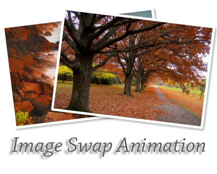
Few weeks ago I posted a tutorial about Awesome Jquery Rotate Effect For Blogger Images. Actually you can add that image rotating to your side bar with some special image, who want to make their blog attractive.Anyway,Today im gonna explain about,Make Image swap animation with using CSS key-frames. Most of every new browsers are support with this effect. You can add this to blogger side bar by resizing images.Im just using CSS for this swapping effect. CSS code is too long for this widgets.Hope you can understand it.if you have any problem regarding to this tutorial let me know.


Image+swap+animation

Make Image swap animation with using CSS


1. Log in to blogger account and Click drop down.
blog-post-option
2. Now select "Layout" Like Below.

3. Click Add Gadget and select 'HTML/Javascript

4. Paste below code. (You can add any Names for Title )

<style>
.btcontainer {
position: relative;margin: 30px;height: 250px;width: 550px;float: left;}
/*Photo Border*/
.imagebt1, .imagebt2 {
border: 5px solid #fff;border-radius: 3px;height: 200px;margin: 20px;position: absolute;width: 300px;
-webkit-box-shadow: 3px 3px 3px rgba(0,0,0,0.3);
box-shadow: 3px 3px 3px rgba(0,0,0,0.3);}
.imagebt1 {
-webkit-transform: rotate(-7deg);-moz-transform: rotate(-7deg);-o-transform: rotate(-7deg);-ms-transform: rotate(-7deg);transform: rotate(-7deg);}
.imagebt2 {
  left: 100px;-webkit-transform: rotate(7deg);-moz-transform: rotate(7deg);-o-transform: rotate(7deg);-ms-transform: rotate(7deg);transform: rotate(7deg);}
/*HOVERS*/
.btcontainer:hover {
  cursor: pointer;}
.btcontainer:hover .imagebt1 {
  -webkit-animation: imagebt1 1.5s 2 alternate;-moz-animation: imagebt1 1.5s 2 alternate;-ms-animation: imagebt1 1.5s 2 alternate;-o-animation: imagebt1 1.5s 2 alternate;animation: imagebt1 1.5s 2 alternate;
}
.btcontainer:hover .imagebt2 {
  -webkit-animation: imagebt2 1.5s 2 alternate;
     -moz-animation: imagebt2 1.5s 2 alternate;
      -ms-animation: imagebt2 1.5s 2 alternate;
       -o-animation: imagebt2 1.5s 2 alternate;
          animation: imagebt2 1.5s 2 alternate;}
@keyframes "imagebt1" {
 0% {-webkit-transform: rotate(-7deg);-moz-transform: rotate(-7deg);-o-transform: rotate(-7deg);-ms-transform: rotate(-7deg);transform: rotate(-7deg);
 }
 50% {-webkit-transform: rotate(-14deg);-moz-transform: rotate(-14deg);-o-transform: rotate(-14deg);-ms-transform: rotate(-14deg);transform: rotate(-14deg);
 }
 100% {-webkit-transform: rotate(-7deg);-moz-transform: rotate(-7deg);-o-transform: rotate(-7deg);-ms-transform: rotate(-7deg);transform: rotate(-7deg);
 }}
@-moz-keyframes imagebt1 {
 0% {
   -moz-transform: rotate(-7deg);transform: rotate(-7deg);
 }
 50% {
   -moz-transform: rotate(-14deg);transform: rotate(-14deg);
 }
 100% {
   -moz-transform: rotate(-7deg);transform: rotate(-7deg);
 }
}
@-webkit-keyframes "imagebt1" {
 0% {
   -webkit-transform: rotate(-7deg);transform: rotate(-7deg);
 }
 50% {
   -webkit-transform: rotate(-14deg);transform: rotate(-14deg);
 }
 100% {
   -webkit-transform: rotate(-7deg);transform: rotate(-7deg);
 }
}
@-ms-keyframes "imagebt1" {
 0% {-ms-transform: rotate(-7deg);transform: rotate(-7deg);
 }
 50% {-ms-transform: rotate(-14deg);transform: rotate(-14deg);
 }
 100% {-ms-transform: rotate(-7deg);transform: rotate(-7deg);
 }
}
@-o-keyframes "imagebt1" {
 0% {-o-transform: rotate(-7deg);transform: rotate(-7deg);
 }
 50% {-o-transform: rotate(-14deg);transform: rotate(-14deg);
 }
 100% {-o-transform: rotate(-7deg);transform: rotate(-7deg);
 }
}
@keyframes "imagebt2" {
 0% {
    left: 100px;z-index: 1;-webkit-transform: rotate(7deg);-moz-transform: rotate(7deg);-o-transform: rotate(7deg);-ms-transform: rotate(7deg);transform: rotate(7deg);
 }
 49% {
    left: 350px;z-index: 1;-webkit-transform: rotate(20deg);-moz-transform: rotate(20deg);-o-transform: rotate(20deg);-ms-transform: rotate(20deg);transform: rotate(20deg);
 }
 50% {
    left: 350px;z-index: -3;-webkit-transform: rotate(20deg);-moz-transform: rotate(20deg);-o-transform: rotate(20deg);-ms-transform: rotate(20deg);transform: rotate(20deg);
 }
 100% {
    left: 100px;z-index: -3;-webkit-transform: rotate(7deg);-moz-transform: rotate(7deg);-o-transform: rotate(7deg);-ms-transform: rotate(7deg);transform: rotate(7deg);
 }
}
@-moz-keyframes imagebt2 {
 0% {left: 100px;z-index: 1;-moz-transform: rotate(7deg);transform: rotate(7deg);
 }
 49% {
   left: 350px;z-index: 1;-moz-transform: rotate(20deg);transform: rotate(20deg);
 }
 50% {
   left: 350px;z-index: -3;-moz-transform: rotate(20deg);transform: rotate(20deg);
 }
 100% {
   left: 100px;z-index: -3;-moz-transform: rotate(7deg);transform: rotate(7deg);
 }
}
@-webkit-keyframes "imagebt2" {
 0% {left: 100px;z-index: 1;-webkit-transform: rotate(7deg);transform: rotate(7deg);
 }
 49% {
   left: 350px;z-index: 1;-webkit-transform: rotate(20deg);transform: rotate(20deg);
 }
 50% {left: 350px;z-index: -3;-webkit-transform: rotate(20deg);transform: rotate(20deg);
 }
 100% {left: 100px;z-index: -3;-webkit-transform: rotate(7deg);transform: rotate(7deg);
 }
}
@-ms-keyframes "imagebt2" {
 0% {left: 100px;z-index: 1;-ms-transform: rotate(7deg);transform: rotate(7deg);
 }
 49% {left: 350px;z-index: 1;-ms-transform: rotate(20deg);transform: rotate(20deg);
 }
 50% {left: 350px;z-index: -3;-ms-transform: rotate(20deg);transform: rotate(20deg);
 }
 100% {left: 100px;z-index: -3;-ms-transform: rotate(7deg);transform: rotate(7deg);
 }
}
@-o-keyframes "imagebt2" {
 0% {left: 100px;z-index: 1;-o-transform: rotate(7deg);transform: rotate(7deg);
 }
 49% {left: 350px;z-index: 1;-o-transform: rotate(20deg);transform: rotate(20deg);
 }
 50% {left: 350px;z-index: -3;-o-transform: rotate(20deg);transform: rotate(20deg);
 }
 100% {left: 100px;z-index: -3;-o-transform: rotate(7deg);transform: rotate(7deg);
 }
}
</style>

<div class="btcontainer">
  <img class="imagebt1" src="https://blogger.googleusercontent.com/img/b/R29vZ2xl/AVvXsEg3_TZWll9RQFcqLKkAwf21LWwL16N9Bq7unR6sjxMvjIrVmd3BXxD-ShIYV28xg4JKk34B9lNNF1kGcnlUcNt2X7XX16S7032SQ3d11uE6U1x94wicevuQBlsa-jMLAS_rfUOWEyrH0II/s1600/image1bt.jpg" alt="">
  <img class="imagebt2" src="https://blogger.googleusercontent.com/img/b/R29vZ2xl/AVvXsEj_tzD0HfF4zC9gM-FwqCjcCPG03FU_iP5Hmew4GmFgnkNb0L_7kMtCmTWINflQgQjcxamPXTdHJ_fSDvmZrGE3CgE2jQDjuMyo9ebCGeIV6hSSmp77zVhXCnvljTf9m5CJ72XUFgLh16Q/s1600/image2bt.jpg" alt="">
</div>
You can change above two urls for changing your images.

5. Now save your HTML/Javascript'. You are done...
If you need any help for Image Swap Animation Widget, Just leave a comment.

How to Add Fixed Social Media Sidebar for Blogger

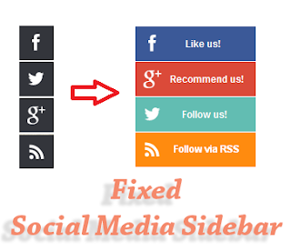
In this  tutorial im gonna  explain  how  to add  Fixed social  media  bar  for  blogger.  By  using this social media sidebar you can link your social media  profile Facebook, Twitter Google plus and Rss feed. Check the  demo  from  below link. If you want to look at other social media bar.

Social+Media+bar

How to Add Social Media bar for Blogger


1.
Log in to blogger account and Click drop down.
blog-post-option
2. Now select "Layout" Like Below.

3. Click Add Gadget and select 'HTML/Javascript

4. Paste  below code.

<style>
.fixedmenu{ background:url('https://blogger.googleusercontent.com/img/b/R29vZ2xl/AVvXsEhNyZZkB6o8twmQ0DdfvKfpIJJWhXc2t_En-NJu19lUR2DQWbyuBitJKMr2OHCt0HVKFcqzZzOedkFrGLJhu6Kq8i4FjBOjKjp3aMAnJnBBHFJweaxQfaH3wgh_mEapjKhKDShexwKXI-k/s1600/facebook.png');background-repeat:no-repeat;width:43px;height:43px;position:fixed;right:0px;top:160px; z-index:1000;}
.fixedmenu1{ background:url('https://blogger.googleusercontent.com/img/b/R29vZ2xl/AVvXsEiMiHEVI_jCtGfeW8u_GDzIoLG5TYob_dNtKD_gCoUhzhO9346F0B_Zmah7ey48s7M25MKOUr6DMTT5MgbzQIMvpfrZgbsaEwph4tuGvakbXoLbt1iRO6yW9Z5mMpBmdd3oS669SVnaAqs/s1600/facebook-hover.png');background-repeat:no-repeat;width:150px;height:43px;position:fixed;right:0px;top:160px; z-index:1100;}
.fixedmenu_1{margin:0px 0 0 43px}
.fixedmenutw{background:url('https://blogger.googleusercontent.com/img/b/R29vZ2xl/AVvXsEjU4ETCuaKAzXfOTBC5DkbtqgfEH8-UFSAEAFMDDQ5j1h1yT3-xSzRe686Q-xpspK1RFXLyxk-MdUsssQfydFk-6yJm3P-6DkGUhCa15NpVuPPhvSzKewq0i1GheGEmFlQ3SB75NHlzeSA/s1600/twitter.png');background-repeat:no-repeat;width:43px;height:43px;position:fixed;right:0px;top:205px;z-index:1000;}
.fixedmenutw1{background:url('https://blogger.googleusercontent.com/img/b/R29vZ2xl/AVvXsEhMH-VhTyhL7_0uF68GTALU5GIxwFFQJu0VfaHBdX_-QgH1bvk5pAsHW7a86mFOC1icD4v3XioSskN0Ycx7RtKAZhX4seR3_JLhITxwDzY71a4Nfvm8FR0REQ0lXubma_upBHdx7YCWTUE/s1600/twitter_hover.png');background-repeat:no-repeat;width:150px;height:43px;position:fixed;right:0px;top:205px; z-index:1100;}
.fixedmenutw_1{margin:0px 0 0 43px}
.fixedmenufb{background:url('https://blogger.googleusercontent.com/img/b/R29vZ2xl/AVvXsEguM9_1XNebKiq5Irb93ql80VoBo3wQf95WG_fKjCnfdHIaHZCM_3na-TbEqgwXwUFLg1kvMjBvzRY6bVzWwyEmIFQNmJIiLrikHqnpKOv2oA9L01ooRJ74lU9L8CgQlWBk-x_NI8LqFlQ/s1600/Gplus.png');background-repeat:no-repeat;width:43px;height:43px;position:fixed;right:0px;top:250px; z-index:1000;}
.fixedmenufb1{background:url('https://blogger.googleusercontent.com/img/b/R29vZ2xl/AVvXsEgvUQprCwE0rWpwaK9FwDIjlW7Xc0EAnUll6L2DOlkI-CM2XBMmI32t90jXk7M1SWEM2jKsCMarj2Exj7xOif3m8mjmbVxc3xnq960cxTofGl6hujkqIFeVbFhXtDqXY_XHX5kP3Eda96k/s1600/Gplus_hover.png');background-repeat:no-repeat;width:150px;height:43px;position:fixed;right:0px;top:250px; z-index:1100;}
.fixedmenufb_1{margin:0px 0 0 43px}
.fixedmenurss{background:url('https://blogger.googleusercontent.com/img/b/R29vZ2xl/AVvXsEje4VbK-zXRqe04GghKpNECFtQ1ZcYTepmKW1oUSCCpq47O0VTkdTwdxBdq8Lg40NCeNo8xCBoxY6qRzKUgp55S74wmYPREYnWE2MhN4GlokuTZKOX-go7J1VOJLgGZC6uzASXOaoFP8NQ/s1600/rss.png');background-repeat:no-repeat;width:43px;height:43px;position:fixed;right:0px;top:295px; z-index:1000;}
.fixedmenurss1{background:url('https://blogger.googleusercontent.com/img/b/R29vZ2xl/AVvXsEhd7tsLR_NFE3CMwwadHuSa-NEnZL-qXOpA-ehOF9W4lZZF8GQKGqfKldeCKqEtGQdvVjgcm5VX7egxtM6rYBfHEVxNKMXg4wQMKBKDPEu7r1vba34hv-qnLpc1sa6WKodf8GszJg8kg_8/s1600/RSS-hover.png');background-repeat:no-repeat;width:150px;height:43px;position:fixed;right:0px;top:295px; z-index:1100;}
.fixedmenurss_1{margin:0px 0 0 43px}
</style>
<div class='fixedmenu' onmouseout='this.className=&apos;fixedmenu&apos;' onmouseover='this.className=&apos;fixedmenu1&apos;'><div class='fixedmenu_1'>
<a href='https://www.facebook.com/bloggertrix' target='_blank'><img alt='Like us on Facebook' src='https://blogger.googleusercontent.com/img/b/R29vZ2xl/AVvXsEhegOnm7z_JPnt2L3nTtvbNpFAIfs9psjQydx0tRjHijR7BAPwjmzd6tpjQg6VncrrOIDDI0TVthnm2ez2WWnFiB7ub3WzbK9broQkIxW3D-eo9dpD8Ad4A1PoJISOjNrEzaWlOcF76nxE/s1600/facebook-hover1.png' title='Like us on Facebook'/></a><br/>
</div></div><div class='fixedmenutw' onmouseout='this.className=&apos;fixedmenutw&apos;' onmouseover='this.className=&apos;fixedmenutw1&apos;'><div class='fixedmenutw_1'>
<a href='https://twitter.com/bloggertrix' target='_blank'><img alt='Follow us on Twitter' src='https://blogger.googleusercontent.com/img/b/R29vZ2xl/AVvXsEjD4rtXV1P8fL62aOgR_4nz0HnDyQCx2egkCDEH4RvbY7NZFsz6wCfv6UQ-8x5_BimSlG8z4D9E60LVMkoRRa4jyE80tttBhM6jDzoBh16mfGe50vR93gorYv0AXruJsVOzKyxX2zVs7t0/s1600/twitter_hover1.png' title='Follow us on Twitter'/></a><br/>
</div></div><div class='fixedmenufb' onmouseout='this.className=&apos;fixedmenufb&apos;' onmouseover='this.className=&apos;fixedmenufb1&apos;'><div class='fixedmenufb_1'>
<a href='https://plus.google.com/ID' target='_blank'><img alt='Recommend us on Google Plus' src='https://blogger.googleusercontent.com/img/b/R29vZ2xl/AVvXsEgz1JxnWCOmSrooNnNg9sMyiHRoUxUZaGo0kwqFIAoFVNnFduBrID9rlotJYEeqC1m9t2tZnqLeV7xuT47ecPWi8QdGjtS_I-G8ZakF9Yu5jAmIgw7n8Gaf8JCGUUvRKnMssqmmfQvJ-K0/s1600/Gplus_hover1.png' title='Recommend us on Google Plus'/></a><br/>
</div></div><div class='fixedmenurss' onmouseout='this.className=&apos;fixedmenurss&apos;' onmouseover='this.className=&apos;fixedmenurss1&apos;'><div class='fixedmenurss_1'>
<a href='http://feeds.feedburner.com/bloggertrix target='_blank'><img alt='Subscribe me on RSS' src='https://blogger.googleusercontent.com/img/b/R29vZ2xl/AVvXsEim0AQt0OZEc3Q6fsCBJFTMgBg3HxuyNCVhBrOLElG4f9UXJahfEDzarqOC5hGTlCzP4iP2u7f6VNidCtEA8PAsZsJW2OYricUv5Jt9QpXbJyYj6kU9k-OfW0NKXYsGNS1Mc-gYRf8vuPQ/s1600/RSS-hover1.png' title='Subscribe me'/></a><br/>
</div></div>

Replace bloggertrix with your Facebook username
Replace bloggertrix with your Twitter Username
Replace ID with your Google plus ID
Replace bloggertrix with your Feedburner ID

5. Now save your HTML/Javascript'.
    You are done...
If you have any problems regarding social media bar.Leave a comment.I will help.

Round Corners Popular Post Widget for Blogger


In this  tutorial im gonna  explain  how to add Round corner  popular  post  widget  for blogger.This works fine with every modern web  browsers. I used  CSS3 to provide   rounded corner  around all the post.You can follow below step to add it to your blog.Lets see how we can add this to blogger.


Round-corners-popular-post-widget


How to add Round Corners Popular Post Widget for Blogger


1. Log in to blogger account and Click drop down.
blog-post-option
2. Now select "Template" Like Below.

Select-template

3. Now you can see Live on blog, Click EDIT HTML Button"

4. Find this tag by using Ctrl+F    ]]></b:skin>

5. Paste below code Before ]]></b:skin> tag

/* The CSS Code for the menu starts here bloggertrix.com */
.popular-posts ul{padding-left:0px;}
.popular-posts ul li {background: #FFF url() no-repeat scroll 5px 10px;
list-style-type: none;padding:5px 5px 5px 20px !important;
border: 1px solid #ddd;border-radius:30px;
-moz-border-radius:30px;
-webkit-border-radius:30px;
-moz-border-radius: 30px;
-webkit-border-radius: 30px;
height: 40px;
-moz-box-shadow: 3px 2px 5px #242424;
-webkit-box-shadow: 3px 2px 5px #242424;
box-shadow: 3px 2px 5px #242424;margin-bottom: 5px;height: 40px;
}
.popular-posts ul li a {
font-style: italic;
}
.popular-posts ul li:hover {
border:1px solid #d10202;
 -moz-box-shadow: 3px 2px 5px #d10202;
-webkit-box-shadow: 3px 2px 5px #d10202;
box-shadow: 3px 2px 5px #d10202;
}
.popular-posts ul
li a:hover {
text-decoration:none;
}
.popular-posts .item-thumbnail img {
height:40px;width:40px;
webkit-border-radius: 100px;-moz-border-radius: 100px;border-radius: 100px;
-webkit-box-shadow: 0 1px 3px rgba(0, 0, 0, .4);-moz-box-shadow: 0 1px 3px rgba(0, 0, 0, .4);box-shadow: 0 1px 3px rgba(0, 0, 0, .4);
}
.popular-posts .item-thumbnail img:hover{
-moz-box-shadow: 0px 0px 5px #d10202;
-webkit-box-shadow: 0px 0px 5px #d10202;
box-shadow: 0px 0px 5px #d10202;}

6. Go to blogger and click Layout >> Add Gadget and select "Popular Posts"

7. Now you need to Configure Popular Posts.

Configure-Popular-Posts
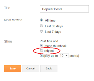
This is designed for popular post without description. So, you have to Uncheck the snippet like above.Change other options as your like.

8.
Now save your "Popular Posts"
    You are done...

Underline Hover Effect Css Navigation Bar for Blogger


This is a Underline  Hover Effect  Css  Navigation Bar.In
this tutorial im gonna  explain,  how to  add it to blogger.
This   menu   work   fine  with  every   modern   internet 
browsers.You can link with your main   pages by  using
this  navigation  bar.  Im  using  Css3  and  HTML, 

Underline+Hover+Effect+Css+Navigation+Bar


1. Log in to blogger account and Click drop down.
blog-post-option
2. Now select "Template" Like Below.

Select-template

3. Now you can see Live on blog, Click EDIT HTML Button"

4. Find this tag by using Ctrl+F    ]]></b:skin>

5. Paste below code Before ]]></b:skin> tag

/* The CSS Code for the menu starts here bloggertrix.com */


#arrowunderlinebtrix{
list-style-type:none;
margin:0;
padding:0;
text-align:center; 
font: bold 16px Georgia;
}

#arrowunderlinebtrix li{
display:inline;
margin-right:25px; 
}

#arrowunderlinebtrix li a{
position:relative;
color:black;
padding-bottom:8px; 
text-decoration:none;

}

#arrowunderlinebtrix li a:hover{
border-bottom:3px solid #25bd0d; 
}

#arrowunderlinebtrix li a:hover:after{ 
content:'';
width:0;
height:0;
position:absolute;
left:50%;
margin-left:-5px; 
bottom: 0;
border-width:5px; 
border-style:solid;
border-color: transparent transparent #25bd0d transparent; 
}


6. Go to blogger and click Layout

7. Click Add Gadget and select 'HTML/Javascript

8. Paste below code.

<div id="arrowunderline">
<ul>
<li><a href="#"><span>Home</span></a></li>
<li><a href="#"><span>Download</span></a></li>
<li><a href="#"><span>CSS</span></a></li>
<li><a href="#"><span>About</span></a></li>
<li><a href="http://www.bloggertrix.com/"><span>Contact Us</span></a></li>
</ul>
</div>
Replace # with your links.

9. Now save your HTML/Javascript'.

    You are done...

Back To Top